
Reed Bye, former faculty member at Naropa, recently sat down with Jane Dalrymple-Hollo to discuss her recent show at Naropa and her life as an artist. Jane Dalrymple-Hollo has been a part of the Naropa community since moving to Boulder in 1985 with her husband, the late Anselm Hollo, a beloved poet and faculty member of the Jack Kerouac School. She was a faculty-level book conservator at the Lee Library of Brigham Young University before moving to Boulder, where, in addition to making art, she has been a long-term volunteer advisor and advocate for Naropa University’s audio and institutional archives.
See more of Jane’s work and read the full interview here.
Reed:
In “Between the Lines,” your recent show at Naropa, your works are striking perhaps first in their geometric formalities and relations. Would you begin by saying something briefly about your primary influences, as you see them, toward this mode and style of composition?
Jane:
I think, from childhood, my innate formality may have been a way of trying to tame the incomprehensible. I always loved to draw and paint and make things, and I was often appointed the task of designing bulletin boards in middle school. But I wasn’t introduced to the arts, per se, until late high school, and I didn’t have a lot of art supplies. I remember turning Rhododendron petals upside down to make fairy dresses, and conjuring fairy houses on paper or with cardboard constructions, and later, making “architectural plans” for dream-houses that included horses and elaborate horse barns. I realize now that everything I’ve ever drawn, painted or constructed has been, at its core, some kind of self-portrait, and it’s probably a good thing that I didn’t have much early exposure to “packaged creativity.”
A turning point was having the opportunity to take a survey History of Art course during the second semester of my senior year in high school – a rather prestigious school in Atlanta, Georgia, where I had been a boarding student since 10th grade. I was so lost and miserable by then that my condition would have probably been classified as major depression, had I been “diagnosed,” but that final semester changed my life. The art history textbook was the classic Janson, History of Art, The Western Tradition, and my teacher, probably a recent college graduate, was so enthusiastic about things like the “contrapposto” of Michelangelo’s “David” that she practically danced in front her slide projections. Suddenly I had a frame of reference through which to experience everything – from history to mathematics, and I wanted to study. On top of that, in a different context that same semester, I discovered Marcel Duchamp. That introduction came through a required American History course taught by a teacher who, I realize now, must have been comparatively liberal, given the backgrounds of most of the students in that particular school. In doing research for my final term paper in that class, for which I chose the New York Armory Show of 1913 as my subject, I was immediately intrigued by the concept of Dada, with its emphasis on chance, games, and mysterious play. I can still recall the strange empowerment I felt in quoting the critic who disdainfully described Duchamp’s “Nude Descending a Staircase,” as “A Staircase Descending a Nude.” It was an light-bulb moment and I instinctively I knew that from then on, magnetic north of my intellectual compass would, somehow or another, lead me in the direction of the unconventional.
Reed:
You have written of your artistic process, “I divide the picture plane with lines, angles, and curves, making them relate to the edges and the lines already drawn, according to my subjective experience of ‘juxtapositional tension’ between the lines.” Can you say more about this experience of entering into the tension, and, I would add, sparkling conversation, between lines, angles, and curves in your drawing and painting as it goes along? And, as a second part, I’d be particularly interested to hear how the experience of different degrees and ambiguities of depth develop within the picture plane.
Jane:
Years ago, a teacher at Anderson Ranch Art Center, Gregory Botts, asked me to describe the “generative principle” of my drawings and paintings. I replied that I tend to approach the paper or canvas with no preconceived subject or plan. Usually beginning with a pencil and using the edges as benchmarks, I set out lines, angles, and curves, positioning each in relation to the whole, with the goal of creating a “tension” or “vibe” (something akin to a tone generated by a guitar or violin string) between the individual parts as well as between the parts and the whole. Gregory paused for a long moment and replied, “Oh, ‘Juxtaposition as Content.’” Later, after reading Frank Stella’s 1983 Norton Lectures at Harvard, published as a treatise called, Working Space, I became interested in the idea of adding the illusion of “foreground, middle ground, background” to my primarily flat linear compositions. I couldn’t articulate it at the time, but I was looking for another level of interaction between the divided spaces, something that would suggest depth. I floundered around with this idea for a long time before finding a “key,” through, oddly enough, a disciple of Frank Stella.
I grew up in rural Mississippi, but my family often visited my grandmother in the state capitol, so I took a sentimental journey back to Jackson last fall (2014) with a stop at the Mississippi Museum of Art. As I walked through the excellent permanent collection of “Mississippi Artists,” I was thrilled to find myself standing in front of a very large painting (8’ tall and 10’ wide, titled “Arcola”) by Valerie Jaudon, a New York artist who grew up in Mississippi, whose work I have long admired. Her paintings are often compared to Stella’s early black and white paintings, and as I walked up close to examine this huge but subtle, flat, yet almost architectural – as in cathedral-like – painting, I noticed something it shares with Frank Stella’s early works. The pencil lines around which the “content” is built are still visible on the raw canvas, like the middle-line of a country highway, in between the “positive-space” expanses of color on either side. And I suddenly thought, “I don’t have to efface the lines!” I had always known that my work is based on line, but, in the “Between the Lines” series, I turned the lines into a matrix, like an overlay, calling attention to the flatness of the surface, but also suggesting depth through the devices of layering, perspective, and/or a horizon. This was a big leap, and allowing the lines, rather than the colors, to “tell the story” was amazingly liberating.
However, this exciting “solution” also led to a paradox. The strategies I used to indicate depth – layering, perspective, and/or adding a horizon line — led me inexorably into a space that was intended to be abstract, but it feels like a “human” space. A friend who visited my studio shortly before “Between the Lines” was hung surprisingly, but astutely, compared my work to that of Giorgio de Chirico, who has never crossed my mind as a mentor, or even an influence. But I have to admit that this work appears to have transported me into a domain that could be described as a “personal surrealism.”
Reed:
Colors and their relations, too, are extremely, though subtly, dynamic in and among the shapes of your paintings. Tell us more about color in your work. Do these choices and relations also spring from this feel for juxtaposition and its dialogue and tension?
Jane:
I have had a long struggle with color, and the “Between the Lines” series was a breakthrough in that realm as well. I’ve looked back at previous paintings and some of them work, but others seem to partake of “The More Color the Better” theory, where the color completely overwhelms the composition. I’ve been studying color, in one way or another, for years, but most recently in an Anderson Ranch workshop with David Hornung. (His “Color: A Workshop for Artists and Designers,” is the best textbook on color theory I know.) His class was great, but I had the opportunity to visit a museum with him later and, as we were both looking at a particularly fine painting by Ben Nicholson, I believe, David said something that completely changed the way I see and work with color. “Notice how satisfying it is to have slight variations of what is essentially the same color repeated in a painting,” he said, pointing out a pale muted blue, a slightly grayer version of the same, and another, very close to the other two, but with maybe just a hint of pink. Each color seemed to “whisper” to the others, as if they were actors and the canvas was the stage. The actual differences in hue and value were minute, but they were strikingly effective in adding a delicious complexity to an otherwise very simple composition.
Reed:
You were married to the poet and translator and Naropa professor Anselm Hollo for many years until he passed away two-and-half years ago. I know he was a great supporter of your artistic work. Was there an affinity in your relationship with respect to personal proclivities or feelings about artistic composition that crossed lines between painting and poetry? It seems to me so, and I’d love to hear your response.
Jane:
I designed most of the covers for Anselm’s books, beginning with “Pick Up the House,” published soon after our marriage in 1985, and all of the ones published thereafter by Anselm’s dear friend, the late Allan Kornblum, founder of Coffee House Press. And yes, I think my design sense dovetailed nicely with Anselm’s own quirky “formalism.” For instance, he had the most charmingly distinctive handwriting! It reminded me somehow of musical notation, and I used to say, sincerely, that I had fallen in love with Anselm because of his handwriting. The next two books published by Coffee House, were “Outlying Districts” (1987) and “Corvus” (1995), bookends to, “Near Miss Haiku,” by Yellow Press (1990). They were all pre-PhotoShop, and they are among my favorites, possibly because of the meticulous and difficult-to-correct process the designs entailed. Between the illustration-board, Letraset film, press-type or, in the case of “Outlying Districts,” hand lettering, there is more immediacy and “evidence of the hand” in those covers than most of the ones I designed after learning computer graphics.
“Corvus” was fun because it was a real collaboration. The title is a pun on Anselm’s name: “hollo” means “raven” in Hungarian, which is (somewhat) linguistically related to Finnish. (Anselm was born and raised in Finland, though Finnish was his third language, after German – the language his parents spoke at home, and Swedish, the language in which he learned to read.) The cover of “Corvus” features a quirky little cartoon-raven that Anselm drew on the computer, just playing around with an early graphic design program called, “MacPaint.” I “cleaned up” the edges and superimposed the little critter on a stamp-like shape that became the centerpiece of the cover design. That little raven was one of Anselm’s rare, but always adorable self-portraits, and I’ve always cherished it. Through many of our 30 years together, Anselm and I sent out collaborative “post-mail” and then e-mail greetings for Christmas or the New Year, which I always enjoyed, even if, by the time we got to the digital era, it took me almost all night to post the messages to friends and poet-colleagues all over the U.S., and indeed, the world — without overloading the “out box.” Anselm produced some wonderful poems under those deadlines.
But to be honest, I sublimated my art “career” for significant stretches of time into dedication to Anselm’s work and well-being, and by extension, to Naropa. But, aside from the marvelous camaraderie amongst the poets and the wonderful things that happened at Naropa, especially during the Summer Writing Program, there were a lot of “perks” associated with being Anselm’s partner. For instance, I had the amazing good fortune of accompanying him on reading and teaching trips to interesting places in the U.S., Finland, and England, and to Artist’s Residencies in France, Sweden, and Italy. I always managed to make art in those situations, though I often had to improvise a workspace, but, on the whole, my art-making time tended to be fractured – though Anselm was absolutely correct in pointing out that this was my choice, and my responsibility.
More recently, the work I produced for the “Between the Lines,” has helped me focus on my most cherished aspiration — to create, in my lifetime, a cohesive “body of work.” And I think of the individual pieces in this show as having a kind of “conversation’ with one another, and with me, that I am eager to continue.
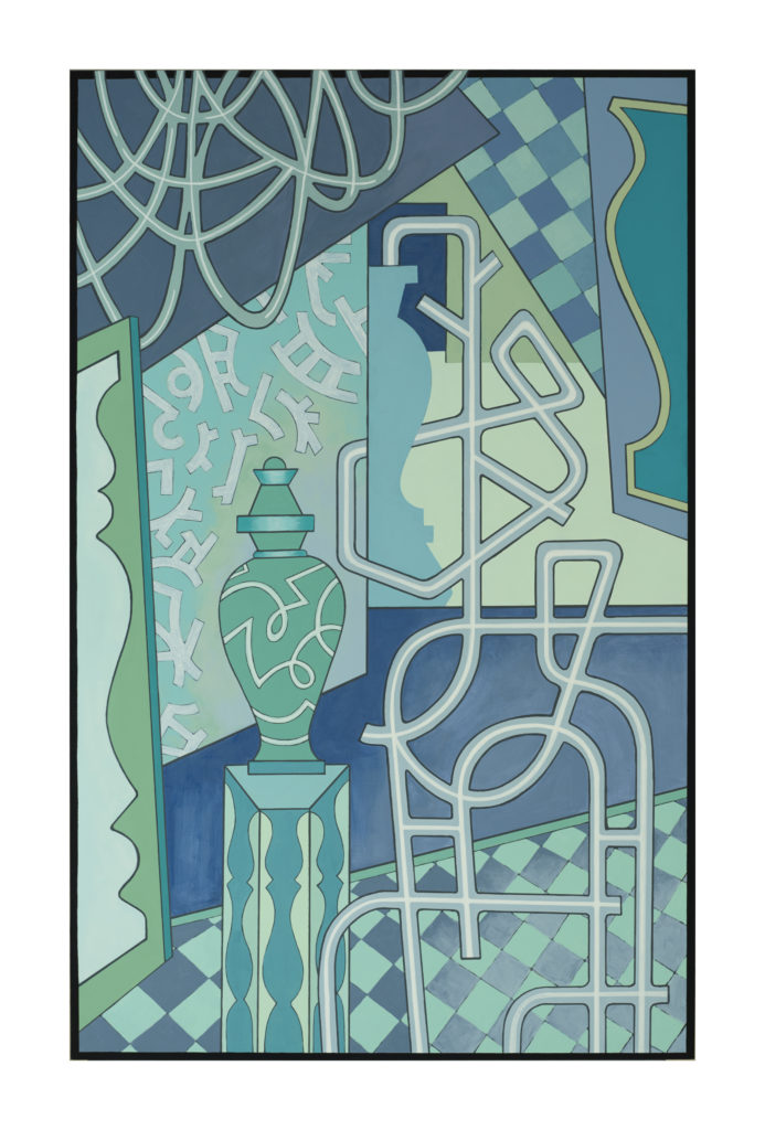
Reed:
Like a tour guide, could you take us briefly through the evolution of one of the paintings in this show from its beginnings to its finished state?
Jane:
The painting titled “A Secret” came about in distinct steps, along with three other paintings of the same size (38” x 24”) that I worked through concurrently. All of the “Between the Lines” paintings began with line drawings, but some of the drawings were full scale, and others were sketchbook sized. I made the smaller drawings to scale so I could have them digitally enlarged, and then I traced them onto the hardboard surfaces. The drawing for “A Secret” began with the pipe-like shapes in the foreground, which, in its early stages, looked something like a chair. But that felt too whimsical, so I drew and erased until I arrived at the shape you see in the painting. I was balancing that shape with the other parts at the same time, all in terms of line. The game pieces sliced down the middle and urn shapes have been part of my visual repertoire for a long time – going back to several pieces I made under the rubric, “Games without Rules.” The rope-like loops in the upper left of the painting came about as “foils” for the chair/pipes/trellis shape in the foreground. If all of these elements have “meaning,” it’s in the way they interact with the overall configuration of the lines, and the spaces between them, in the painting. My preference is to have the viewer experience the work intuitively, as I do.
